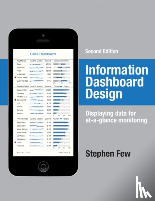
A leader in the field of data visualization, Stephen Few exposes the common problems in dashboard design and describes its best practices in great detail and with a multitude of examples in this updated second edition. According to the author, dashboards have become a popular means to present critical information at a glance, yet few do so effectively. He purports that when designed well, dashboards engage the power of visual perception to communicate a dense collection of information efficiently and with exceptional clarity and that visual design skills that address the unique challenges of dashboards are not intuitive but rather learned. The book not only teaches how to design dashboards but also gives a deep understanding of the concepts--rooted in brain science--that explain the why behind the how. This revised edition offers six new chapters with sections that focus on fundamental considerations while assessing requirements, in-depth instruction in the design of bullet graphs and sparklines, and critical steps to follow during the design process. Examples of graphics and dashboards have been updated throughout, including additional samples of well-designed dashboards.
I have a question about the book:
'Information Dashboard Design - Few, Stephen'.
Fill in the form below.
We will respond as fast as possible.
We value your privacy
We use cookies to measure traffic, improve Boekstra and let Google tailor ads to your interests. You can keep using the site either way — even if you decline. More info